Strombine
STROMBINE - Released for Quake 4 on March 18th, 2007
I'd been doing a bunch of experimentation on the side with the Doom3/Quake4 engine, noodling problems and issues the meager community is pretty familiar with. They all got lumped into one map through various circumstances, and I decided that even though it isn't a proper map I'd release it anyway in the hope that people could pick up some ideas from my methods.
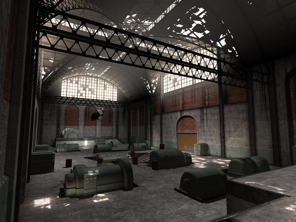
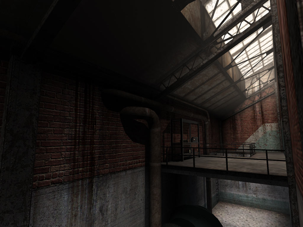
The first thing I tackled was a realistic setting, including textures. That was just a personal learning process for me, to try and make something other than rusty metal look realistic in diff/norm/spec (and to make the rusty metal look better). I've drooled on sites like Opacity for years so I finally emulated the ruined factory setting a little more closely. I could have done a hell of a lot more here, because the place is still nowhere near as dirty as it could and should be.
One of the engine issues I tried to tackle was how texture variety kills performance in idTech4 by splitting batches. The idea I wanted to try was to build the map in something slightly more akin to the Geometry Competition process, with fewer larger and more featureless textures to model forms, and liberal use of decals on top (paged for batchiness) to add all those missing stains and seams and construction tells to the brushwork that are normally baked into the textures themselves. The idea is you get a lot of variety instead of repeating the same 128x128 panels all over, and also more freedom with brushwork, because texture application would be much more fluid and receptive, because you place all the welds and edges by hand. The big green machines around the map were built the same way - two big painted-metal pages, put together over a myriad of different machine-looking shapes with some rusty edge-trim applied wherever necessary.
Performance-wise it worked great: the main room of this map has about 160k triangles in the worst corners but runs as if it had a third of that. Visually, though, it's painfully apparent that the map is just some big plain textures with decals all over them. I may simply have just not really taken the best approach with how I balanced one against the other. The very regular and functional architecture in this map was probably really not the way to test the idea but I had it on the brain and couldn't help it. Ultimately it weakened the map by making it look bare and empty. I'm still not fully convinced it's a COMPLETELY terrible idea, and I think it might work better when used in a more gregarious fashion - ie, more obvious 'sweeping' decals rather than fiddly edges, with zany nunuk-esque geometry that actually warrants this kind of liquid approach - and backed up by a little more traditional texturing.
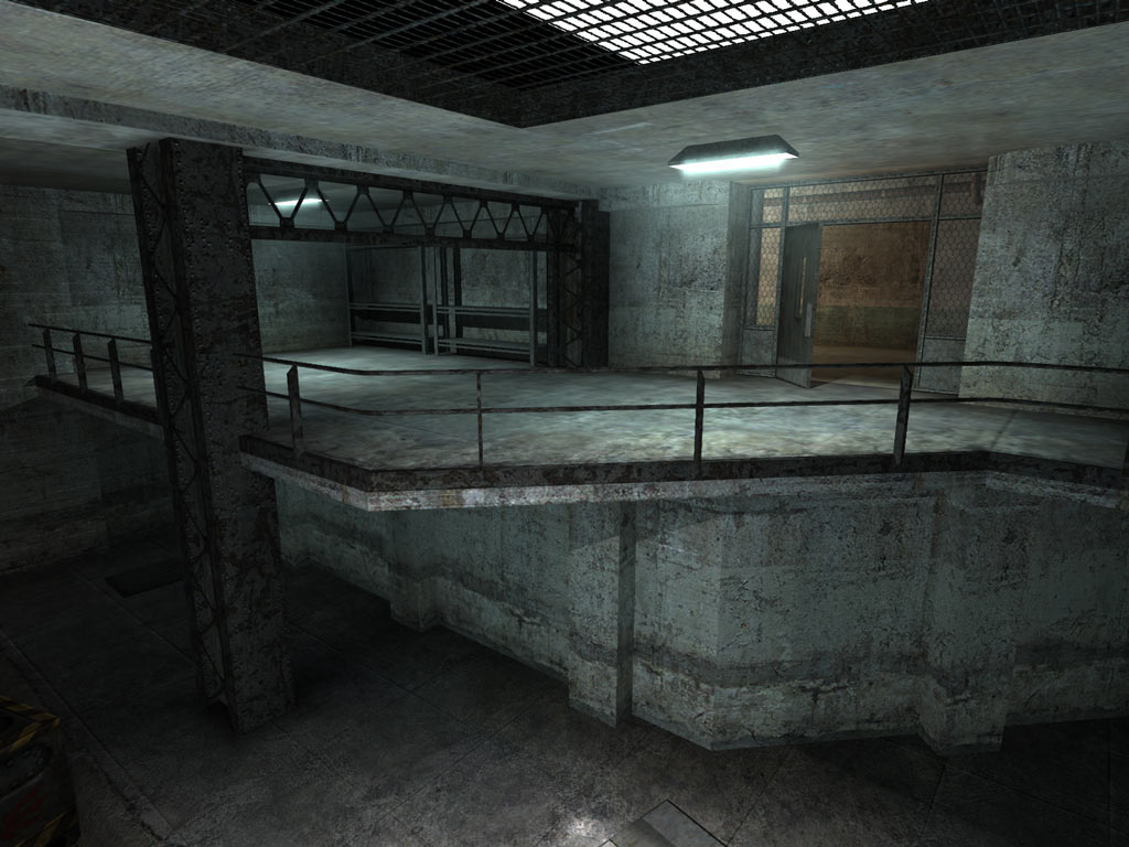
Another issue was the perennial favorite, the lighting. D3/Q4 clearly can't do reflected light very well - bounce lights with shadows are kind of ugly and obvious and also expensive to layer, bounce lights without shadows look ugly and obvious for other reasons, and the ambient (to anyone with at least one eye open) just sucks. By investigating the game's fragment programs I came to the realization that it is to your artistic advantage to paint a unique image for every light source, because you get almost no performance savings by reusing the same lights. The ambient usually looks so horrible because it's a consistently even brightness throughout the volume (that and the lack of normal shading in d3, which q4 'fixes'), but by painting light images for them you can get the smooth gradations that you'd need to better simulate scattered light. You have to shape your rooms with the light volumes in mind, but if you do that right you can fit one or two ambient light volumes over the room with maps painted to match just the lights and geometry in that room.
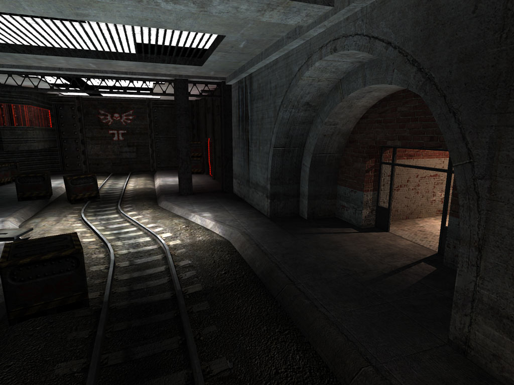
You can do this for the direct light sources too (which you'll need far fewer of with the improved ambient), adding blurry shadows on the broad axis. I exploited this a bit in Strombine by rotating light volumes and putting them in long hallway-like spaces sideways to put the least-controllable axis of the light (the z) on the most linear axis of the room. This worked out a lot better than the texturing thing, and I didn't even take it as far as I could.
The gameplay is nothing to really scream about. I was having fun in Doomscript trying to pull off some gameplay-related functionality other than scripted sequences you just sit and watch, and I had succeeded in reproducing a few things from HL2:
- the boxes that always have ammo in them when you open them (the marine box and lid with an invisible gui on a patch over the box that triggers the lid and an item spawner)
- big tempting cranks that slowly raise doors while you hold them down (same gui trick with sloppy state-based door and wheel behavior that responds to mouseDown and mouseUp)
- the laser-beam Combine snipers that shoot physics objects when they can't see you (hundreds of lines of terrifying Doomscript AI)
Wanting to try the snipers out in a real map context influenced the design of the main room, which is why it feels so empty and spacious. (Making it a train station instead of a factory would have given the map a lot more reasons to look like it does.) I had an idea for tying the other two things into the same scenario - play it and see - so I rolled all three into the map and added some Strogg blundering around in what seemed like sensible places for good measure. I had to explain visually why there were Strogg in this realistic factory, though, so I busted out the Q4PowerPlant set and added some burrowed-in bunkers that admittedly are also pretty much just like HL2. I acknowledged that with the tongue-in-cheek title "Strombine" (patent pending).
Strombine.zip
- Brushes: 5941
- Modes: Single Player
- Filesize: 61.6MB